tutorials
How to draw an animated circle around a word on Shopify
Three ways to add a hand-drawn, animated circle around a word on your Shopify storefront — SVG stroke-dasharray, copy-paste Liquid, or a one-tag Pulsar install.

Look at the hero on ycombinator.com, on notion.so, on visme.co — somewhere in the headline there's a single word with a hand-drawn circle scribbled around it, drawing itself in as the page loads. It's the most-imitated typographic effect of the last five years for one good reason: it tells the reader exactly which word matters without leaning on bold or italic, both of which their eye already filters out. This guide is the full story of how that effect actually works under the hood, and three ways to put it on a Shopify storefront — ranked by how much of your weekend it will cost.
TL;DR
- Fastest: install Pulsar, wrap a word in
$c{color: #FACC15}now$. One tag, scroll-triggered draw-on animation, works on every 2.0 theme. Pro feature. - Free + manual: hand-roll an inline
<svg>with astroke-dasharrayanimation and drop it into a Rich Text section. Works, but the SVG has to be tuned per-word and breaks when the line wraps. - Heavy: ship a Lottie file via a third-party animation app. Pixel-perfect but adds 40–120kb of JS to your hero — bad trade for one word.

How the effect actually works
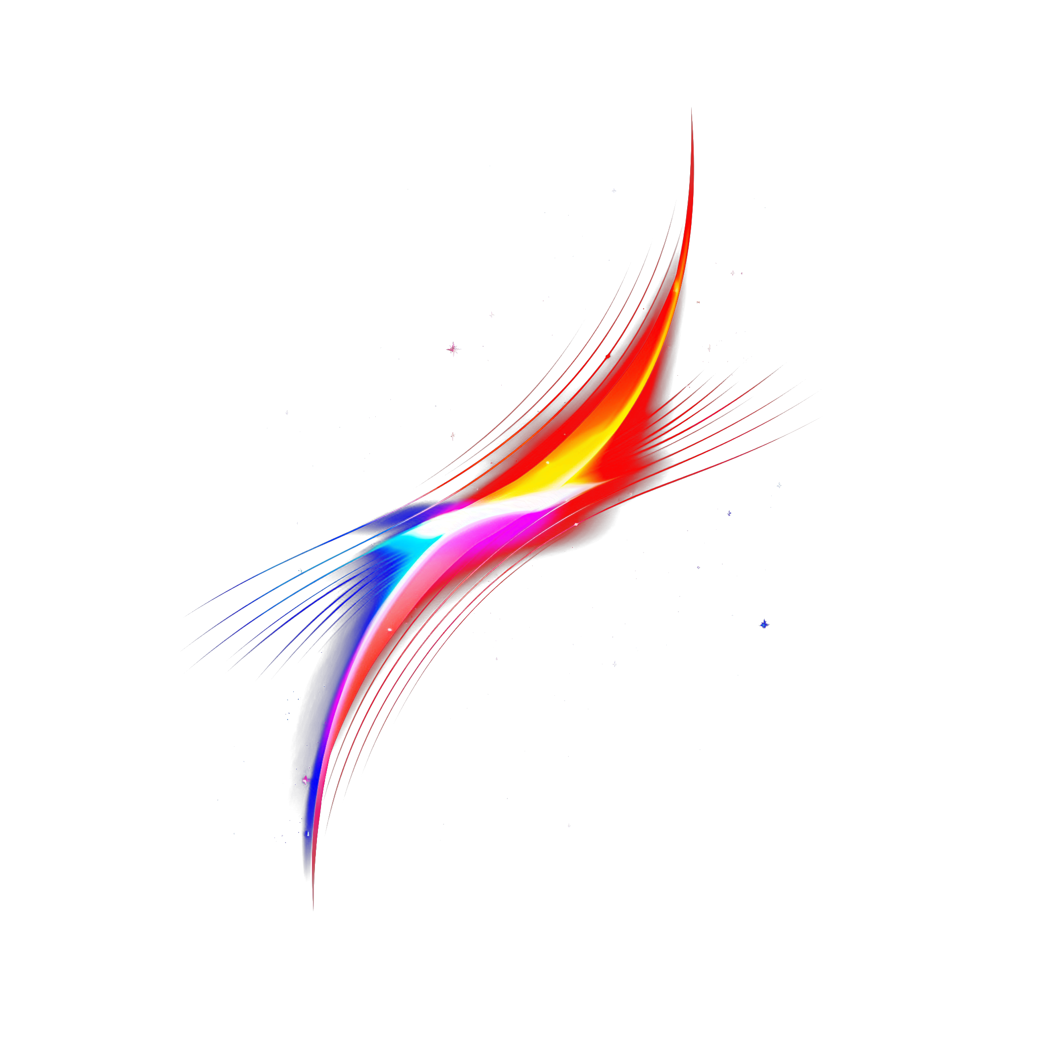
Strip away the framework and the effect is two things: an inline SVG <path> shaped like a messy circle, and a CSS animation on its stroke-dashoffset that traces the path from start to finish. That's it. No images, no canvas, no library.
Step 1 — The hand-drawn path
The circle isn't a <circle> element — those look mechanical. It's a <path> digitized from someone's actual ink scribble. Here's the path Pulsar ships by default, lifted straight from the source:
<svg viewBox="0 0 115.12 98.68" preserveAspectRatio="none">
  <path
    vector-effect="non-scaling-stroke"
    fill="none"
    pathLength="10"
    stroke="#FACC15"
    stroke-width="5"
    stroke-linejoin="round"
    stroke-linecap="round"
    d="M53.1.44C32.68,11.8,15.86,29.52,5.57,50.5c-3.52,7.17-6.34,15.28-4.47,23.05,2.47,10.3,12.47,17.05,22.46,20.59,25.94,9.19,56.83,2.38,76.5-16.85,6.66-6.51,12.19-14.55,13.97-23.69,2.33-11.93-2.3-24.8-11.23-33.04s-21.76-11.81-33.79-10.09"
  />
</svg>
Two attributes do most of the work. vector-effect="non-scaling-stroke" keeps the stroke width constant when the SVG is stretched to wrap a word of any length — without it, your circle's outline gets fat on long words and skinny on short ones. pathLength="10" normalizes the path's length so the JS doesn't have to call getTotalLength() and re-measure on every render. Set both. Skip neither.
Step 2 — The draw-on animation
The trick is stroke-dasharray. By setting the dash to be exactly as long as the path, then offsetting it by the same amount, the stroke is invisible. Animate the offset back to zero and the path appears to draw itself:
// Once the element scrolls into view:
const path = svg.querySelector('path');
const length = path.getTotalLength(); // or use pathLength

path.style.strokeDasharray  = length + ' ' + length;
path.style.strokeDashoffset = length;

// Force a reflow so the next style change is animated, not instant
path.getBoundingClientRect();

path.style.transition       = 'stroke-dashoffset 2s cubic-bezier(0.3, 0, 0.1, 1)';
path.style.strokeDashoffset = '0';Step 3 — Why aspect ratio is the entire ballgame
The SVG has to stretch to fit the word — words are wide, the viewBox is roughly square. If you let the SVG preserve its aspect ratio, the circle ends up tiny and centered. If you stretch it with preserveAspectRatio="none", the circle squishes into an oval that wraps the word — which is what you want. But the stroke would also squish, ending up fat on the top and bottom, thin on the left and right. That's exactly what vector-effect="non-scaling-stroke" solves: the path geometry stretches, the stroke width doesn't. Without this combo, every circle effect looks broken.

The three approaches, side by side
| Approach | Time to ship | Re-tunes per word automatically | Scroll-triggered + reduced-motion safe | Page-weight added | Cost |
|---|---|---|---|---|---|
Pulsar $c{...} tag | ~30 seconds | Yes | Yes, built in | ~6 KB shared script | Pulsar Pro |
| Hand-coded SVG | 30–60 minutes | No (hard-coded viewBox) | Roll your own | < 1 KB per circle | Free |
| Lottie animation app | 10 minutes + monthly fee | No (one file per circle) | Depends on app | 40–120 KB JSON + runtime | $9–$29/mo |
Approach 1 — The Pulsar $c{...} tag
Pulsar ships a custom element called <pulsar-circle> and a tiny tag syntax that compiles to it at runtime. You wrap a word in $c{...}word$ and the theme extension does the rest — measures the word, sizes the SVG, fires the scroll observer, runs the draw-on animation.
We ship code that $c{color: #FACC15; data-stroke-width: 6}actually works$.Every parameter you'd want to tune is an attribute on the tag, separated by ;:
color— any CSS color. Default#60A5FA.opacity—0to1. Useful for layered effects.data-stroke-width— px, mapped throughnon-scaling-stroke. Default10. For short H1 words drop to5–6.effect-id— picks which hand-drawn path to use (Pulsar ships several scribbles).offset-scale—"1.1, 1.1"to puff the circle out around the word. Tweak per font.is-animated—true(default) orfalseif you want the circle static.duration— animation length in seconds. Default3.2.
- Install Pulsar from the Shopify App Store and upgrade to Pro (circle and highlight tags require the Pro plan).
- Enable the Pulsar Inline app embed in your theme (one toggle in the theme editor → App embeds).
- Edit any headline and wrap the word:
$c{color: #FACC15}now$. Save. - Reload your storefront. The circle draws itself the moment the headline scrolls into view.
Approach 2 — Hand-coded SVG dropped into Liquid
If you only need to circle one word, ever, and you don't want a dependency — you can ship the whole effect as inline HTML. The catch: the SVG's viewBox has to roughly match the aspect ratio of the word you're circling, the wrapper has to be position: relative, and the animation has to fire on scroll-in (not page-load) or it'll have already finished by the time the user gets there.
<h1>
  Built for
  <span class="plsr-circle-wrap">
    you
    <svg viewBox="0 0 115 98" preserveAspectRatio="none" aria-hidden="true">
      <path
        vector-effect="non-scaling-stroke"
        fill="none"
        stroke="#FACC15"
        stroke-width="5"
        stroke-linejoin="round"
        stroke-linecap="round"
        d="M53,0C32,11,15,29,5,50c-3,7-6,15-4,23,2,10,12,17,22,20,25,9,56,2,76,-16,6,-6,12,-14,13,-23,2,-11,-2,-24,-11,-33s-21,-11,-33,-10"
      />
    </svg>
  </span>.
</h1>

<style>
  .plsr-circle-wrap { position: relative; display: inline-block; }
  .plsr-circle-wrap svg {
    position: absolute; inset: -0.3em -0.5em;
    width: calc(100% + 1em); height: calc(100% + 0.6em);
    pointer-events: none; z-index: -1;
  }
  .plsr-circle-wrap path {
    stroke-dasharray: 320 320;
    stroke-dashoffset: 320;
    animation: plsr-draw 2s cubic-bezier(0.3,0,0.1,1) 0.3s forwards;
  }
  @keyframes plsr-draw { to { stroke-dashoffset: 0; } }
  @media (prefers-reduced-motion: reduce) {
    .plsr-circle-wrap path { animation: none; stroke-dashoffset: 0; }
  }
</style>Adding the scroll trigger
If your circled word is anywhere except the top of the page, you need to wait until it's visible. Otherwise the animation runs during initial paint and you've shipped a static circle with extra steps.
const wraps = document.querySelectorAll('.plsr-circle-wrap');
const io = new IntersectionObserver((entries, obs) => {
  entries.forEach(e => {
    if (e.isIntersecting) {
      e.target.classList.add('is-in-view');
      obs.unobserve(e.target);
    }
  });
}, { threshold: 0.4 });
wraps.forEach(w => io.observe(w));
Then change your CSS to only run the animation when .is-in-view is present. This is essentially what Pulsar's custom element does internally — see setupIntersectionObserver in the pulsar-circle source.
Approach 3 — Lottie via a third-party animation app
There are a handful of Shopify apps (Lottiefiles, Animator, etc.) that let you drop a Lottie JSON file into a section block. Designers love this path because the Lottie can be drawn in After Effects with whatever wobble you want. Realistic trade-offs:
- Page-weight. A single Lottie circle file is 40–120 KB of JSON plus the ~70 KB Lottie runtime. That's an entire above-the-fold budget for a 30-pixel scribble.
- One file per circle. Change the word? Re-export. Change the color? Re-export. Two words on the page? Two requests.
- No native scroll triggers in most apps. You're back to writing the same
IntersectionObserver. - Cost. Most run $9–$29/month for a feature you could ship in 4 KB.
Lottie is the right tool for complex multi-element animations (a logo that morphs, a character that waves). For a single hand-drawn circle around a single word, it's massively over-spec'd.
Browser support, accessibility, and the gotchas nobody mentions
Browser support
stroke-dasharray + stroke-dashoffset animation works in every browser shipped in the last decade (yes, including all iOS Safari). vector-effect="non-scaling-stroke" is the only piece worth checking — it's been Safari-supported since iOS 13.4 (2020) and is universally fine today. The CSS transition on the stroke property is what some older Android browsers stumble on; if you must support pre-2019 Chromium on cheap Android, fall back to a requestAnimationFrame loop.
Reduced motion
Roughly 5% of users have prefers-reduced-motion turned on, and most of them turned it on for a reason — vestibular triggers, attention disorders, plain preference. Any animated effect on a Shopify storefront needs to respect it. The fix is one media query:
@media (prefers-reduced-motion: reduce) {
  .plsr-circle-wrap path {
    animation: none;
    stroke-dashoffset: 0; /* show the circle, just don't draw it */
  }
}
Pulsar's custom element does this by skipping the IntersectionObserver setup when the media query matches — the path renders fully drawn from the start. No animation, no removed circle.
Screen readers and SEO
The SVG is purely decorative — it's not text the user needs to hear. Two things to do: aria-hidden="true" on the <svg>, and make sure the word being circled stays inside the heading as plain text. Googlebot reads <h1>Built for you.</h1> whether the word you has a scribble around it or not. The Pulsar custom element handles this automatically — the visible text is a <slot>, not an attribute, so it's part of the document outline.
When to use this effect — and when not to
The hand-drawn circle is high-attention. That's its strength and its danger. A few rules from shipping it on a few hundred Shopify stores:
- One per viewport, max. Two circles in the same screen cancel each other out and the page reads as chaotic.
- Circle a noun or a number. "Built for you." "Ships in 24 hours." Circling an adjective or verb ("truly custom") almost always feels off.
- Don't circle inside a button. The two animations fight for attention and the button stops reading as clickable.
- Pick a color that contrasts the page, not just the text. A yellow circle on a white page on yellow text is a moiré pattern, not an effect.
- Avoid above the fold + below the fold both circling. Pick one. The scroll-in retrigger on the second one feels gimmicky.
If you want the deeper version of this calculus — when text animations help conversion vs. when they tank it — there's a full write-up over in when animated text works on Shopify.
Common bugs and fixes
+The circle renders but doesn't animate
strokeDashoffset and adding the transition. Browsers batch style writes; without path.getBoundingClientRect() (or any other layout-flushing read) in between, both writes apply in the same frame and there's nothing to animate from.+The circle is the wrong shape — too tall and skinny or too short and fat
viewBox aspect ratio has to roughly match the wrapper's aspect ratio. With preserveAspectRatio="none", the path stretches to fill — so a square viewBox over a wide word becomes an oval. That's usually what you want. If it looks broken, tune offset-scale (Pulsar) or the wrapper's padding (DIY).+The animation runs every time I scroll past, not just once
IntersectionObserver calls observer.unobserve(entry.target) after the first hit. Without that, every re-entry into the viewport re-fires the animation, which most users read as a glitch.+It works on desktop but iOS Safari shows the circle without animating
vector-effect="non-scaling-stroke" and silently disable the stroke transition. That's a sub-1% user share in 2026; if you still need it, replace the SVG stroke with a CSS-animated clip-path reveal of a static circle PNG.+The circle appears behind a background image and gets clipped
z-index: -1 so it sits behind its containing text. If a parent has overflow: hidden or its own stacking context with a background, the circle disappears. Either remove the overflow on the immediate parent, or set the wrapper to isolation: isolate (Pulsar does this) to trap the negative z-index inside the wrapper.Which approach should you pick?
If you want this shipped in 30 seconds and re-editable from the theme editor by a non-developer — use Pulsar's $c{...} tag. If you're a developer building a one-off custom site for a client who never edits content and you genuinely enjoy tuning viewBox values — hand-code it. If you already pay for a Lottie app and have a designer who wants the wobble in After Effects — fine, but don't add a new app for one circle. Anywhere on this spectrum is fine, as long as you don't ship the version with vector-effect="none" and a <circle> element. That's the broken one every other tutorial gives you.
Once you've got the circle dialed in, the same primitives — SVG path, scroll trigger, dasharray draw-on — power the highlight underline effect too. The highlight-text guide walks through the rectangular variant, and the Pulsar syntax cheatsheet has every tag on one page if you just want the reference card.
About the author
The Pulsar team
Shopify text styling
Pulsar is the easiest way to stylize headlines in your Shopify store — colors, gradients, animated highlights and circles, no theme code required.
Install Pulsar — Free

