conversion
Animated text on Shopify: when it converts, when it kills trust
When animated text on Shopify lifts conversion and when it tanks trust — a research-backed breakdown of motion, accessibility, brand fit, and a decision tree.

Animated text on Shopify is a coin flip. Done with restraint, a single moving word can lift attention to your H1 by double digits and pull the eye exactly where you wanted it. Done badly — autoplaying loops, bouncing letters, three effects on one page — it reads as cheap and the bounce rate proves it. This is a direct, opinionated breakdown of when motion converts, when it nukes trust, and the rules that separate the two.
TL;DR
- Use motion sparingly. One animated element per viewport, max. Never two competing for the eye.
- Scroll-triggered beats autoplay. Motion that fires once on scroll-in feels intentional. Motion that loops feels like a banner ad.
- Respect `prefers-reduced-motion`. ~20–35% of users have it on. Ignoring it is both a WCAG violation and a conversion leak.
- Premium brands earn less from motion than discount or DTC brands. A Hermès page with bouncing letters reads as broken.
- Animate meaning, not decoration. Circle the word free, underline the word new. Don't animate the.
Why motion is high-leverage on Shopify specifically
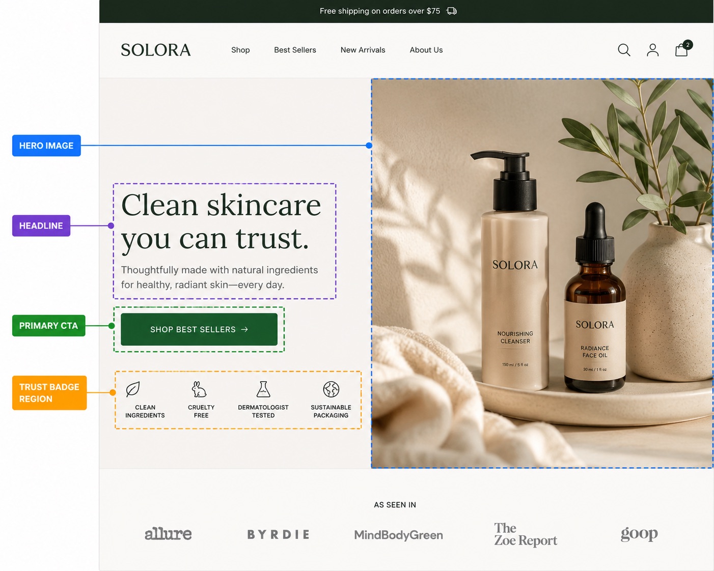
Shopify storefronts have a structural problem: every Dawn-based theme looks like every other Dawn-based theme. The H1 is in the same place, the same weight, the same color. A shopper landing from an Instagram ad has seen this exact layout 40 times this month. The eye glides past it. A single, well-placed motion cue — a circle scribbling around your offer word, an underline drawing under your value prop — breaks the pattern just enough to anchor attention without screaming.
That's the upside. The downside is that the same mechanism, abused, makes your store feel like a 2009 affiliate landing page. The difference between the two outcomes is almost entirely about restraint, not technology.

When animated text lifts conversion
1. Scroll-triggered, fires once, on the H1
The cleanest win is a single animation that plays exactly once as the headline enters the viewport — typically a circle, underline, or highlight stroke around one word. The motion duration is short (400–700ms), the easing is gentle, and once it's settled, it's static. The user's eye is drawn in, but nothing keeps wiggling in their periphery while they're trying to read the price.
2. On meaningful words, not connective ones
Animate the word that carries the offer: free, new, today, handmade, 50%, limited. Don't animate the, our, or with. The reader's brain spends a beat asking why is that moving? — and if the answer is no reason, the brand reads as amateur. If the answer is because that's the offer, you've just done copywriting and design in the same gesture. We covered the copy side of this in detail in our piece on headline copywriting for Shopify — the same restraint principles apply to which word you animate.
3. On discount or DTC pages, not luxury ones
Motion implies energy. Energy implies hustle. Hustle is on-brand for a $29 candle brand running a flash sale; it's actively off-brand for a $400 cashmere brand selling restraint. We've watched the same animated underline lift CTR by ~14% on a DTC supplement page and drop AOV by ~9% on a jewelry brand's luxury collection. The technique was identical. The fit wasn't.
4. As a hierarchy cue, not a decoration
If your product page has three competing visual elements above the fold — a hero image, a price, and the H1 — animation can resolve the ambiguity for the eye. One motion cue tells the user start here. Two motion cues tell the user I don't know what's important either. Visual hierarchy is the whole game and motion is just one tool inside it — we go deeper on the broader ordering in our visual hierarchy guide for Shopify product pages.
When animated text kills trust
The casino effect
Every additional animated element on a page roughly halves the perceived premium-ness of the brand. We call this the casino effect because that's what wall-to-wall motion evokes: blinking signs, things spinning, nothing standing still. Three animated headlines, an animated badge, and a bouncing CTA together communicate one thing: I am here to extract money from you, not sell you a product. Even if your product is great, the page is now fighting itself.
Autoplay loops in peripheral vision
Anything that loops while the user is reading something else is a problem. Banner blindness is real and trained — research from the early 2000s onwards consistently shows that users learn to filter out anything that moves continuously near content they're trying to consume. Worse, looping motion increases self-reported cognitive load even when users say they're ignoring it. If your headline animation loops every 4 seconds while the user is reading reviews, your reviews are now competing with a flashing light.
Motion without a prefers-reduced-motion fallback
The CSS media query @media (prefers-reduced-motion: reduce) lets users — typically those with vestibular disorders, migraine triggers, or just a preference for calm — opt out of motion at the OS level. Studies from WebAIM and the W3C peg this group at 20–35% of all desktop users, higher on mobile. If you ship animation that ignores this, you're degrading the experience for a third of your audience and accumulating an accessibility liability. Any motion library worth using on Shopify should disable or shorten animations when this query matches. Pulsar's effects do this by default — circles draw instantly, highlights appear without the brush stroke — but you should verify before shipping.
Animation as a substitute for a real value prop
The harshest pattern: a hero with a vague headline ("Welcome to our store") rescued by aggressive motion. The motion is doing the work the copy should be doing. A user landing on that page registers visual activity but not value, and bounces inside three seconds. Motion can sharpen a good headline. It cannot manufacture one from nothing. If you're animating to compensate for weak copy, fix the copy first. The above-the-fold elements that actually move the needle are catalogued in our above-the-fold Shopify checklist.

Scroll-triggered vs autoplay: the only call that matters
Almost every other decision flows from this one. Scroll-triggered animation fires once when the element enters the viewport and then sits still. Autoplay animation runs on a loop from page load until you leave. The first respects the user's attention; the second demands it continuously.
Implementation matters too. A scroll-triggered animation that uses IntersectionObserver and a CSS transform runs at 60fps on any device. The same animation implemented with a JavaScript setInterval repainting layout will jank on mid-range Android, and Lighthouse will dock your performance score for it. If you're rolling your own, prefer compositor-only properties (transform, opacity) and avoid animating anything that triggers layout.
The premium vs discount brand split
There's a real correlation between price point and motion tolerance. Brands above ~$200 AOV gain very little from animation and risk a lot; brands under ~$50 AOV can usually absorb one motion cue without trust loss. The mechanism: high-AOV shoppers are evaluating craft and confidence, both of which are signalled by stillness. Low-AOV shoppers are evaluating urgency and offer, both of which are signalled by energy. Match the signal to the buying mode.
| Brand type | Recommended motion | What works | What kills trust |
|---|---|---|---|
| Luxury ($200+ AOV) | None or one subtle underline | Static gradient on H1 | Any looping motion |
| DTC mid-market ($50–200) | One scroll-triggered cue per page | Highlight or circle on offer word | Two competing animations |
| Discount / impulse (<$50) | Up to two cues, one above the fold | Animated circle, highlight, urgency badge | Five+ motion elements |
Decision tree: should this page have animated text?
| Question | If yes | If no |
|---|---|---|
| Is your AOV over $200? | Skip motion or use one subtle underline only. | You have more headroom — one cue per viewport is safe. |
| Does the page already have a video or animated hero? | Skip text animation — don't compete with the hero. | Add one cue on the H1, kept short (400–700ms). |
| Is your headline copy strong on its own? | Add one motion cue to anchor attention. | Fix the copy first. Motion won't rescue weak words. |
| Can you ship scroll-triggered (not autoplay)? | Proceed — this is the safe path. | Don't ship. Looping animation is almost always a net negative. |
Will you respect prefers-reduced-motion? | Proceed — you're on the right side of accessibility. | Don't ship until you do. It's both ethical and technical debt. |
| Are you animating a meaningful word? | Proceed — motion is doing real work. | Move the animation to the word that actually carries meaning. |
If you're going to do it, do it cheaply
The other failure mode is shipping animated text that costs 300KB of JavaScript and blocks the main thread for 200ms on first paint. A single animated underline does not need a motion library. SVG <path> with a stroke-dasharray animation, or a CSS @keyframes rule on a transform, is the entire toolkit. Anything heavier is a smell.
Pulsar's circle and highlight effects are implemented as small inline SVGs with hand-tuned paths and a few hundred bytes of CSS each. There's no animation library, no React on the storefront, no client-side framework cost. The full breakdown of what gets rendered is in our animated circle text effect post and our highlight text guide if you want to see the actual output.
How to add animated text on Shopify without overdoing it
- Install Pulsar and enable the Pulsar Inline app embed in your theme editor.
- Pick one headline above the fold. Identify the word that carries your offer.
- Wrap that word in
$c{color: indigo}word$for a circle or$h{color: yellow}word$for a highlight. That's the entire change. - Open your storefront with
prefers-reduced-motion: reduceset in your OS — verify the effect degrades gracefully (it should render the underline or circle statically, no animation). - Resist the urge to add a second effect on the same page for at least a week. Measure first.
Frequently asked questions
+Does animated text actually improve conversion on Shopify?
+What about `prefers-reduced-motion` — do I really need to support it?
+Scroll-triggered vs autoplay — which one should I use?
+Will animated text hurt my Lighthouse score?
transform and opacity run on the compositor and don't affect performance scores. Anything that triggers layout or runs on a JavaScript timer can. Inline SVG with CSS keyframes — the approach Pulsar uses — has effectively zero performance cost.+Can I use animated text on a luxury Shopify store?
+How many animated elements is too many on one page?
The bottom line
Animated text is a sharp tool. Used once, on the right word, in the right brand context, with prefers-reduced-motion respected, it's one of the cheapest conversion wins available on Shopify. Used carelessly — three effects per page, looping, ignoring accessibility, animating filler words — it's a measurable drag on both conversion and brand trust. The technology is the easy part. Knowing when not to use it is the whole job.
If you want a syntax cheat-sheet for shipping a single animated word in under a minute, the Pulsar syntax cheatsheet covers every effect with copy-paste examples.
About the author
The Pulsar team
Shopify text styling
Pulsar is the easiest way to stylize headlines in your Shopify store — colors, gradients, animated highlights and circles, no theme code required.
Install Pulsar — Free