The Pulsar Blog
Shopify text, design, and conversion — done right.
Practical, deeply-researched guides for Shopify merchants and developers. How to style your headlines, optimize for conversion, and ship a storefront people remember.

All articles
17 posts
 Pulsar·
Pulsar syntax cheatsheet: every tag, in one page
Every Pulsar tag in one reference. Color, gradient, CSS gradient, the universal Pro span, animated circles, and animated highlights — with anatomy, defaults, and the mistakes that quietly break them.
Read Shopify·
Shopify headline styling: the complete 2026 guide
Headlines do more conversion work than any other text on your storefront. This is the long-form guide to every dimension of Shopify headline styling — and the three honest ways to ship it without breaking your theme.
Read Comparisons·
The best Shopify text effect apps in 2026
Most Shopify text effect apps fall into one of two architectures, and one of them quietly slows your store down. Here's how to evaluate them, what to look for, and the categories of solution actually worth installing in 2026.
Read Conversion·
Animated text on Shopify: when it converts, when it kills trust
Animated headlines either earn attention or burn it. A direct, opinionated guide to when motion lifts conversion on Shopify, when it nukes trust, and the rules separating the two — with a decision tree at the end.
Read Tutorials·
How to add a highlighter underline to Shopify headlines (no code)
A complete, working guide to adding a marker-style highlight or animated underline to any Shopify 2.0 headline — including the scroll-triggered draw-on, the reduced-motion fallback, and the colors that don't look like a 2017 SaaS pitch deck.
Read Tutorials·
How to draw an animated circle around a word on Shopify
The hand-drawn circle that wraps a word on YC, Notion, and Visme landing pages — how the SVG geometry actually works, why aspect ratio breaks it, and three ways to ship it on a Shopify theme without breaking your H1.
Read Shopify·
Shopify H1 best practices: copy, length, and SEO impact in 2026
The full technical and copy breakdown of H1s on Shopify — one per page, the 40-70 character sweet spot, the brand-name trap on homepages, JSON-LD matching, and how Dawn, Sense, and Refresh render H1s by default.
Read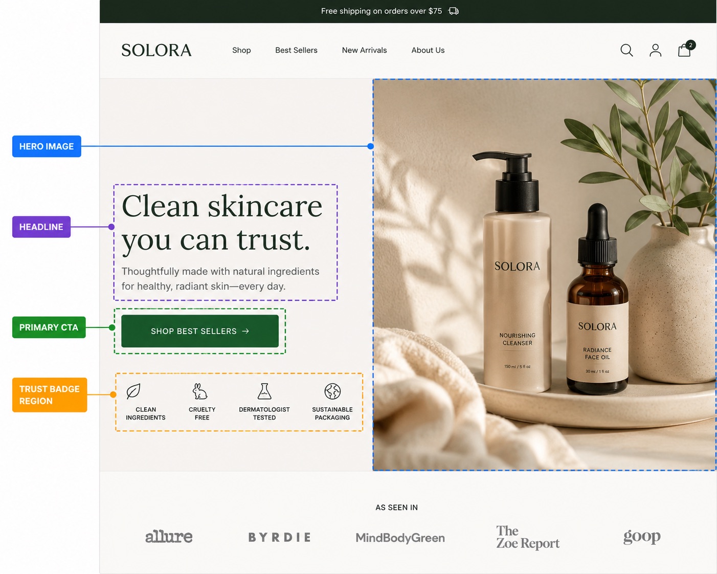 Conversion·
Above the fold on Shopify: 9 fixes that lift conversion this week
Nine things to fix above the fold on a Shopify storefront — ranked by how much they actually move conversion. Each item: what it is, why it matters, and the Shopify-specific fix.
Read Design·
Color psychology for ecommerce headlines (with actual data)
Forget 'red equals urgency.' The real drivers of headline color conversion are contrast, category fit, and brand consistency — in that order. Here's what the research actually says, plus palettes by vertical.
Read Design·
Visual hierarchy on Shopify product pages: a field guide
Most Shopify product pages are visually flat — every element shouting at the same volume. This guide breaks the PDP into four hierarchy layers, shows how to weight each one with size, color, and spacing, and points out where Dawn and Refresh leave money on the table.
Read Shopify·
How to customize a Shopify theme without touching code
A practical, opinionated guide to customizing a Shopify 2.0 theme using only the editor, settings, and app embeds — plus the exact decision tree for when no-code stops being enough.
Read Conversion·
Headline copywriting for Shopify: what actually converts
A practical, opinionated guide to writing Shopify headlines that clarify, differentiate, and set tone — with six battle-tested formulas, the data behind length, and side-by-side examples of what converts vs what doesn't.
Read Comparisons·
Pulsar vs custom CSS: which should you actually use?
When does hand-rolled CSS beat an app, and when does an app beat hand-rolled CSS? A frank head-to-head across the eight things that actually matter on a real Shopify store.
Read Pulsar·
How to install Pulsar in your Shopify store (60-second guide)
Step-by-step install for Pulsar Elements — App Store install, theme embed toggle, settings verification, and your first inline tag. With the three things that go wrong and how to fix them.
Read Pulsar·
Using Pulsar with Dawn, Sense, Refresh and other Shopify themes
Pulsar works on every Shopify 2.0 theme, but each one hides the app embed toggle in a slightly different place and ships slightly different headline tags. Here's the per-theme breakdown — Dawn first, then Sense, Refresh, Spotlight, Studio, Craft, Origin, Crave, and the universal rule for everything else.
Read Shopify·
Shopify theme app extensions, explained for merchants and developers
Theme app extensions (TAEs) are how modern Shopify apps add code to your storefront without ever touching theme files. Here's what they are, what changed in 2022, and why every app you install in 2026 ships one.
Read
Stop reading.
Start styling.
Install Pulsar from the Shopify App Store and ship a headline that actually converts — in under a minute.