design
Visual hierarchy on Shopify product pages: a field guide
A field guide to Shopify product page visual hierarchy — the four layers of a PDP, how to weight each one, and the Dawn/Refresh defaults to override.

A product detail page is a hierarchy problem before it's a design problem. The merchant has roughly 800 pixels of vertical space above the fold and a single second of visual attention to decide what the visitor sees first, second, and seventh. Most Shopify themes — Dawn and Refresh included — ship a PDP where everything reads at the same volume: title, price, swatches, description, accordion labels, all competing for the same eye. This is a field guide to fixing that. Four layers, how to weight each one, and what Dawn does wrong by default.
TL;DR
- A PDP has four hierarchy layers: the anchor (product image), primary text (title + price), secondary text (variants, description, social proof), and tertiary (specs, shipping, FAQ).
- Weight each layer using five cues: size, weight, color, position, and motion. Pick two cues per layer — more than that creates noise.
- Dawn and Refresh default to a flat hierarchy — title, price, and variant labels are all 14–16px and the same color. Override this.
- The single biggest win on most Shopify PDPs is separating the primary layer from the secondary layer with a color or weight delta, not just whitespace.

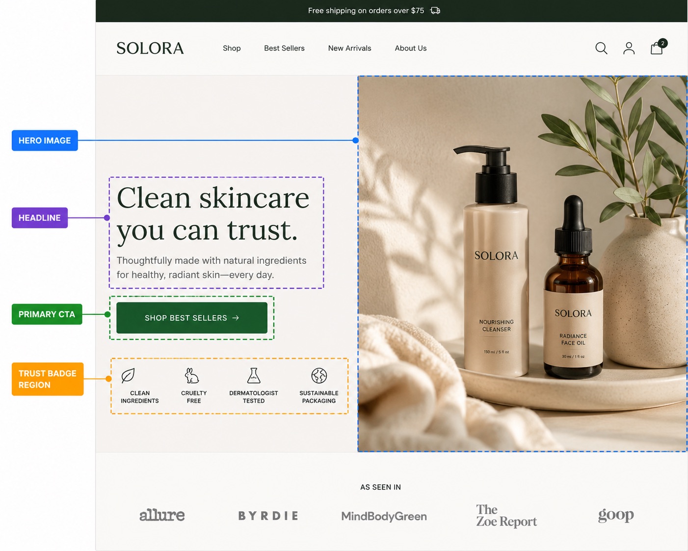
Layer 1 — The anchor (product image)
The product image is not a layer of text, so most hierarchy guides skip it. That's a mistake — the image is the anchor of the entire page. Everything else is positioned relative to where the eye lands first, and on a PDP that's always the hero image. If the image is weak, no headline will rescue it.
Role: establish what the product is in under 200ms. Weight target: dominant. The image should occupy roughly 45–55% of the above-the-fold pixel area on desktop, and 100% of the first scroll on mobile.
How Dawn handles it
Dawn's default media layout is a stacked column on desktop with a centered crop. That's fine for square photography but punishes lifestyle shots — a portrait-oriented image gets squeezed into a square frame and the model's face gets centered on the chest. Refresh is slightly better here; it preserves aspect ratio and uses a side-rail thumbnail strip.
Common mistakes
- Using product photography on a white background with the page background also white. The image has no edge. Add a 1px hairline border or a faint shadow.
- Showing five thumbnails before the customer has registered the hero. The thumbnail strip should be subordinate — smaller, lower contrast, no border.
- Auto-rotating carousels. The eye is forced to chase the image. Don't.
Layer 2 — Primary text (title + price)
The primary text layer is two elements: the product title (H1) and the price. These are the two pieces of information that decide whether the visitor scrolls. They have to read as one cluster, not as two unrelated lines.
Role: identify the product and set the value frame. Weight target: second most dominant element on the page, beaten only by the image. The title should be 28–40px on desktop, 22–28px on mobile. The price should be 20–28px, weight 600+, and live within 24px of the title.
How Dawn handles it
Dawn renders the title at 24px and the price at 18px, both in the same neutral grey. There is no color delta between the title and the surrounding labels — SKU, Vendor, and In stock all sit in the same hierarchy band. The result is a PDP where the title is technically the largest text on the page but doesn't feel like it.
Common mistakes
- Letting the title wrap to three lines on mobile. Cap it. Use
text-wrap: balanceor trim the title —Heavyweight Organic Cotton Tee in Forest Greenshould be aHeavyweight Cotton Teewith the colour shown as a variant label. - Showing the strike-through compare-at price the same size as the live price. The strike should be ~75% of the live price size, in muted grey. Otherwise the eye reads both as equal-weight.
- Using an accent color on the title. Save accent for the price or one styled word. If everything is accented, nothing is.
If you're auditing your own title, our Shopify H1 best practices post breaks the title-specific rules out in more detail.
Layer 3 — Secondary text (variants, description, social proof)
Secondary text is everything the visitor reads after they've decided the product is interesting but before they click Add to Cart. Variants (size, color, options), the short description, review stars and count, shipping pill, stock indicator. Five-ish elements, all of them functional, none of them screaming.
Role: answer the next three questions in order — does it come in my size, what is it actually made of, do other people like it. Weight target: consistent and quiet. Body text size (15–17px), regular weight, neutral color. Distinguished from the primary layer by at least a 30% size drop or a clear color shift to a softer grey.
Variant pickers deserve their own attention
Variants are the secondary element that gets the most clicks. A merchant who buries them under a one-line description loses the visitor to a competitor whose size selector is two finger-taps from the image. Position variants directly under the price, never under the long description.

How Dawn handles it
Dawn's variant pills are visually identical to the rest of the page — same border weight, same color, same hover state. There's no clear affordance that they're picker buttons rather than decoration. Most sub-2-second visitors miss them on the first scan. Refresh is better here; it gives the picker a thicker border and a darker selected state.
Social proof in the secondary layer
Review stars should live in the secondary layer, near the price, not below the description. They're scanning material — visitors check the count and the star rating in under 400ms, then move on. If you've hidden them in an accordion at the bottom of the page, you have effectively no social proof above the fold. Our above-the-fold Shopify checklist goes deeper on this.
Layer 4 — Tertiary (specs, shipping, FAQ)
Tertiary is everything that goes inside an accordion. Specifications, fit guide, shipping timelines, returns policy, care instructions, FAQ. This information matters — but it matters after the visitor has decided they want the product. Putting it in the primary visual band crowds out the elements that drive the decision.
Role: answer the considered-buyer's remaining questions. Weight target: suppressed. Use a collapsible accordion. Labels at 14–16px, regular weight, neutral grey. Body content inside the panel at body size, no special styling. No icons screaming for attention.
Common mistakes
- Expanded-by-default accordions. Defeats the point. The visitor now has six paragraphs of shipping policy sitting between them and the related-products row.
- Color-coded accordion icons. A bright orange chevron pulls focus from the buy button two inches above it.
- Stacking five accordions in a row. Group related items. Product details (materials + dimensions), Shipping & returns (one accordion, not two), FAQ (one accordion).
The five weighting cues, ranked
Once you've identified which layer an element belongs to, you weight it using a combination of five cues. Most designers reach for size first; that's correct, but it's not the only lever. Here's the full set, ranked by how much hierarchy lift you get per unit of effort:
| Cue | Hierarchy lift | Risk of overuse | Best for | Common mistake |
|---|---|---|---|---|
| Size | High | Low | Primary vs secondary separation | Same size for title and variant labels |
| Color | High | Medium | Price, accents, one styled word | Accent on too many elements |
| Weight | Medium | Low | Distinguishing labels from values | All-bold body copy |
| Position | Medium | Low | Above-the-fold ordering | Reviews below the fold |
| Motion | Very high | Very high | Single most important element — pick one | Animating the title and the buy button |
A weighted-right PDP vs a flat one
The fastest way to internalize hierarchy is to look at the same product page rendered two ways. Same content, same image, same theme — only the weighting differs.

What changed on the right-hand version
- Title scaled from 24px to 34px, color shifted from
#3d3d3dto#0f0f0f, tracking tightened by 2%. - Price scaled from 18px to 24px and weight bumped to 700. Compare-at price reduced to 14px and muted to
#999. - Variant pills given a 2px border on the selected state and dropped the hover-only color — the picker now looks tappable from the first frame.
- Description trimmed from four paragraphs to one above the fold; the rest moved to a
Detailsaccordion. - Review stars moved from below the description up next to the price, where the eye actually scans them.
- Shipping pill (
Free shipping over $50) demoted from accent green to neutral grey. It was previously out-weighting the price.
None of these changes required a theme rewrite. Most of them are CSS overrides or content reordering. The hierarchy was already implicit in the content; the original layout just refused to express it.
Where text styling fits in
Hierarchy is mostly about restraint — knowing which elements to not style. But there's one place where adding a single styled element can lift the entire primary layer without disrupting the rest: the one-word accent in the title.
A title like Heavyweight Organic Cotton Tee reads as four equal words. Styling one of them — Heavyweight Organic Cotton @{forest-emerald}Tee@ — gives the eye an anchor inside the title itself. The trick is that you do it once, on one word, on one product page element. Not on the price, not on the description, not on the FAQ. Once. That's how you keep the hierarchy intact while still looking like a brand instead of a Dawn install.
We cover the full pattern library — which word to pick, which color, which effect — in the complete guide to Shopify headline styling. The same logic applies on the PDP, just with stricter restraint: one styled word per page, never on the price.

An audit checklist
Open your live PDP in a private window. Squint until the page goes blurry. Now ask:
- Can you identify the product image instantly? If the image blurs into the page background, add an edge.
- Can you read the title without un-squinting? If not, it's too small or too light.
- Can you locate the price? If your eye has to hunt, weight it harder.
- Can you find the buy button? If it's the same color as the rest of the page chrome, it's invisible.
- Is there exactly one element demanding attention beyond those four? If there are three accent elements, you've broken the hierarchy.
FAQ
+What is visual hierarchy on a Shopify product page?
+How many text sizes should a Shopify PDP have?
+Where should reviews live on a Shopify product page?
+What's the most common Shopify PDP design mistake?
+Should I use animated text effects on a product page?
+Do Dawn and Refresh have good default hierarchy?
Ship the hierarchy fix without a redesign
Most of the changes in this guide are CSS overrides and content reordering — no theme fork required. The one move that lifts the primary layer in 60 seconds is styling a single word of the title. Pulsar lets you do that from any text field in the theme editor: wrap a word in @{color}word@ or @{c1-c2}word@ and it renders at the storefront with no code edits. The free plan covers solid colors and gradients; the Pro plan adds the animated circle and highlight effects that work especially well as a title accent.
About the author
The Pulsar team
Shopify text styling
Pulsar is the easiest way to stylize headlines in your Shopify store — colors, gradients, animated highlights and circles, no theme code required.
Install Pulsar — Free