conversion
Above the fold on Shopify: 9 fixes that lift conversion this week
A 9-item above the fold Shopify checklist covering LCP, hero copy, CTAs, and social proof — tactical fixes you can ship this week to lift conversion.
The above the fold area on a Shopify storefront is the only real estate that 100% of your visitors see. Everything below is optional. Get the fold right and the rest of the page gets a fair hearing; get it wrong and your bounce rate makes every other optimization downstream irrelevant. This is a 9-item checklist of the fixes we run on Pulsar merchant stores when conversion is flat — ordered by impact, not by ease.
What counts as above the fold on Shopify in 2026
There is no single fold anymore. On a 13-inch MacBook the fold sits around 750px tall; on an iPhone 15 Pro it's about 670px; on an iPad mini in portrait it's roughly 950px. When we say above the fold Shopify in this guide, we mean the visible viewport on the smallest device you actually convert from — for almost every merchant, that's mobile. If you optimize the desktop fold and leave mobile broken, you're optimizing for the wrong 30% of your traffic.
The 9-item checklist
- LCP image — the hero must load in under 2.5s on mobile 4G.
- Value prop clarity — pass the 5-second test or you've already lost.
- Hero headline — one H1, in plain English, scannable from across the room.
- Primary CTA — one button, one color, one verb, above the fold.
- Social proof badge — review count, press mention, or trust seal in the fold.
- Navigation density — six links or fewer, not a mega menu wall.
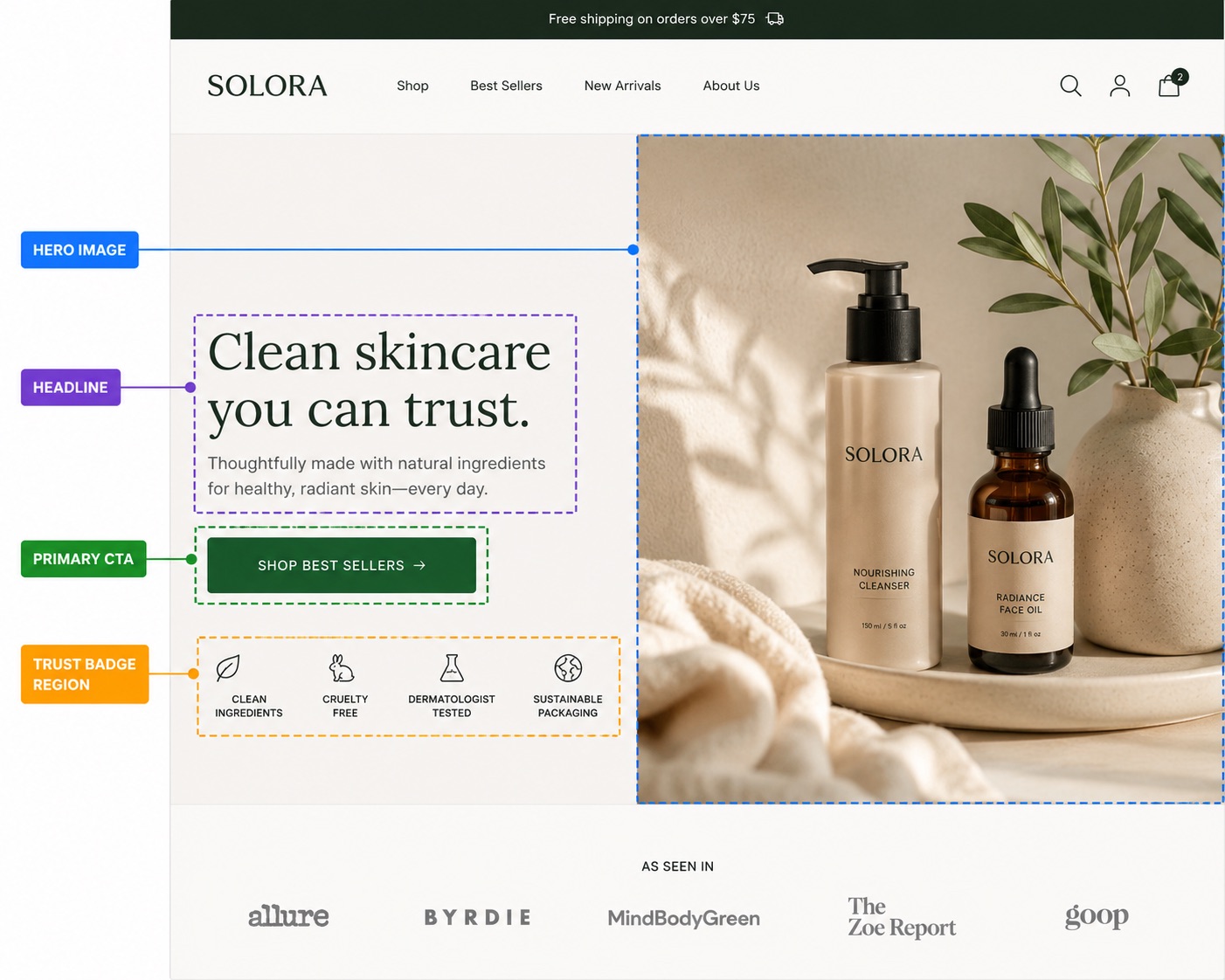
- Hero image relevance — show the product or the outcome, not a model staring out a window.
- Above-fold copy contrast — text legible against the hero with no squinting.
- Mobile thumb zone — primary CTA reachable without two-handing the phone.
1. LCP image — the hero must load fast
Largest Contentful Paint is the single Core Web Vital that correlates most directly with conversion on Shopify. Google's own RUM data shows pages with LCP over 4 seconds bounce roughly 2.5x more than pages under 2.5s. On most Shopify stores, the LCP element is the hero image. Optimize that one image and you've moved the needle more than any other technical fix.
The Shopify-specific fix
- Use Shopify's image filters:
image_url: width: 1600, format: 'webp'in your Liquid. Don't ship the original 4MB PNG the photographer sent. - Add
loading="eager"andfetchpriority="high"to the hero<img>tag. By default, Dawn and most themes lazy-load the hero, which is correct for below-fold images and catastrophic for the LCP element. - Preload the hero in your theme's
<head>:<link rel="preload" as="image" href="{{ hero | image_url: width: 1600, format: 'webp' }}">. - Run PageSpeed Insights on your homepage — anything over 2.5s LCP on mobile is leaving money on the table.
2. Value prop clarity — pass the 5-second test
Show your storefront fold to someone who's never seen the brand for five seconds, then close the tab. Ask them: what does this store sell, and who is it for? If they can't answer both, your value prop isn't above the fold — your aesthetic is. This is the single most common failure mode we see on Shopify storefronts coached by designers who optimize for portfolio screenshots, not revenue.

The fix
Your H1 should answer what, your subheadline should answer for whom, and your hero image should show the outcome. If your headline is Welcome to [Brand], you've burned the most valuable text on the page on a word that means nothing to a first-time visitor. See our deep dive on headline copywriting for Shopify for the templates that consistently beat brand-name headlines in A/B tests.
3. Hero headline — one H1, plain English
Your H1 is the highest-weighted SEO element on the page and the largest piece of text in the visitor's eye line. It's the only piece of copy you can be sure they'll read. Two non-negotiables: there must be exactly one H1 per page, and it must be readable by a non-technical buyer in under two seconds. Clever pun headlines test well in focus groups and badly in checkout funnels.
- One H1 only. Multiple H1s confuse Google and dilute the signal. Use H2s for everything else.
- Front-load the keyword.
Lavender soy candles, hand-poured in BrooklynbeatsHand-poured in Brooklyn — meet our lavender soy candles. - Cap it at 9 words. Longer headlines wrap on mobile and lose impact.
- Style for hierarchy. A solid-black H1 on a white hero reads as default theme. A single accent word styled in your brand color or a subtle gradient reads as intentional. See Shopify H1 best practices for the full breakdown.
4. Primary CTA — one button, one verb
Every above-the-fold area should have exactly one primary call-to-action. Not two equally-weighted buttons. Not a button and a 'learn more' link with the same visual weight. One. The job of the fold is to pick the next click for the visitor; if you give them three equal options you've outsourced your conversion strategy to a stranger who has been on the site for four seconds.
The fix
- Use a verb that describes the next action:
Shop the collection,Build your bundle,Start your quiz. NotLearn more. - Make the button color contrast against the hero. If your hero is dark, the CTA should be light. The button should be the second-most-visible thing on the page after the H1.
- Size it for thumbs — minimum 44 × 44px tap target on mobile, per Apple's HIG.
- Secondary CTAs (e.g.
Watch the video) can exist, but must be visually subordinate — a text link or ghost button, never a second filled button.
5. Social proof badge — earn the click
The fastest way to lift conversion on a fold that's otherwise solid: add a single piece of social proof. A star rating with review count (★★★★★ 4.9 — 2,847 reviews), a press logo strip (As seen in Vogue, Wired, Bon Appétit), or a trust seal (Free shipping over $50 · 30-day returns). Pick one. Don't stack all three — that's anxiety, not trust.

The Shopify-specific fix
Most review apps (Judge.me, Loox, Stamped) expose a Liquid snippet for the aggregate rating. Drop it into your hero section's schema with a setting toggle. If you don't yet have enough reviews to brag about, swap in a press strip or a Loved by 5,000+ customers since 2022 line. Anchor something social above the fold.
6. Navigation density — six links or fewer
The header is part of the fold. Every link in your top nav is competing with your H1 for the visitor's attention. A 12-item navigation with three mega-menus is not a sign of comprehensive merchandising — it's a sign you couldn't decide what to prioritize. Six links or fewer is the limit before scanability drops off a cliff. Pick the categories that drive 80% of revenue and put the rest in the footer.
- Audit your nav links by GA4 click-through. Anything under 2% of header clicks: kill it or move it to the footer.
- On mobile, the header collapses to a hamburger — but the brand name, cart, and search icon all count toward your fold real estate. Strip non-essentials.
- Drop the
Aboutlink from the top nav. Visitors who care will find it in the footer. Visitors who don't shouldn't be tempted to leave the buying funnel.
7. Hero image relevance — show the product
The hero image is doing one of two jobs: showing the product, or showing the outcome the product enables. It is not doing the job of 'evoking a mood'. Mood-only heroes (sun-dappled hands, a window at golden hour, a woman walking away from camera) are what Shopify themes use as placeholders precisely because they're brand-agnostic. If your real hero looks like a theme placeholder, you've failed the relevance test.
The fix
- Product-led hero: the hero IS your bestseller, well-lit, on a clean ground, in front of the headline. This is the default — use it unless you have a strong reason not to.
- Outcome-led hero: show the visible result of using the product — a perfectly poured coffee, a glowing skin close-up, a tidied desk. Works for products whose payoff is sensory.
- Combination hero: product + a human hand or face interacting with it. Strongest for skincare, beverage, and consumables.
Visual composition matters as much as subject choice — read our visual hierarchy guide for Shopify product pages for the rules on where to place the focal point so the eye lands on the CTA after the headline.
8. Above-fold copy contrast — read it without squinting
WCAG AA requires a contrast ratio of 4.5:1 for body text and 3:1 for large text against the background. On a hero with a photographic background, this is the most-violated rule on Shopify storefronts. Light grey 'lifestyle' text over a beach photo looks beautiful in Figma and is functionally illegible on a phone in sunlight.
The fix
- Add a dark overlay (
rgba(0,0,0,0.35)is the safe default) between hero image and text. - Test the actual rendered text contrast with the WebAIM contrast checker. Eyeballing it is not enough — phone screens vary wildly.
- If you're styling part of the headline in a brand color, both stops of any gradient need to clear 3:1 contrast independently. See when animated text works on Shopify for the rule of thumb on accent styling without sacrificing legibility.
9. Mobile thumb zone — reachable without two hands
On a phone held one-handed, the natural thumb arc covers roughly the bottom-center 60% of the screen. Anything in the top corners requires a grip shift. If your primary CTA is in the upper-right of the hero on mobile, you're asking a visitor to reposition the phone to commit — which is a lot of friction for a button that should be the path of least resistance.
The fix
- On mobile, stack hero elements vertically: image → H1 → subhead → CTA. The CTA lands in the thumb zone naturally.
- If your section schema gives you
image_positionoptions, set it totopon mobile andlefton desktop. - Cart and account icons in the header are fine in the top-right — those are conscious actions, not the primary funnel CTA.
Putting it all together
Run the checklist top to bottom. The first three items (LCP, value prop, headline) move conversion the most; the last three (image relevance, contrast, thumb zone) are the polish that compounds. Don't try to ship all nine in a day — pick one per work session, A/B test if you have the traffic, and measure session-to-add-to-cart rate, not raw conversion. The fold's job is to earn the next scroll. Measure that.

Where Pulsar fits
Items 3 (headline) and 8 (contrast) both come down to typography you can ship without touching theme code. Pulsar lets you style any word inside any Shopify section — accent color, gradient, animated underline, or circle highlight — using a tiny inline syntax. Free for solid colors and gradients, Pro for the animated effects. If your headline is the bottleneck on your fold, this is the lowest-friction fix on this list.
FAQ
+What is 'above the fold' on a Shopify store?
+How do I measure if my Shopify above the fold is working?
+What's the most important thing above the fold?
+Should the primary CTA be in the hero on every Shopify page?
Shop the collection on homepage, Add to cart on product) but the rule is the same: one above-fold button, one verb.+How does the Shopify hero affect LCP?
image_url filter with a WebP format, set fetchpriority='high' and loading='eager' on the hero img tag, and preload it in the document head. These three changes typically cut LCP by 30–50% on a Dawn-based theme.+Do mega menus hurt my Shopify above-the-fold conversion?
About the author
The Pulsar team
Shopify text styling
Pulsar is the easiest way to stylize headlines in your Shopify store — colors, gradients, animated highlights and circles, no theme code required.
Install Pulsar — Free

